
Contenido
Visualización de datos
¿Cómo y qué es?
A través de la visualización de datos podemos mostrar patrones, trends y correlaciones en los datos en un contexto visual.
Ventajas:
intuitiva
inmediata
pegajosa
Desventaja:
puede ser engañosa
tenemos a lo muchos 3 dimensiones
Hay diferentes librearias que podemos utilizar para realizar nuestra graficas y pueden ser de más alto o bajo nivel. La más populares son:
Matplotlib: bajo nivel, alta personalización
Pandas visualización: contruida sobre Matplotlib, interfáz facil
Seaborn: interfaz de alto nivel, bonitos estilos de default
ggplot: basado en ggplo2 de R
Plotly: crea graficas interactivas
import pandas as pd
import numpy as np
import seaborn as sns
from matplotlib import pyplot as plt
from sklearn import datasets
Importamos los datos:
iris = pd.read_csv('iris.csv', names=['sepal_length', 'sepal_width', 'petal_length', 'petal_width', 'class'],index_col=False)
iris.head()
---------------------------------------------------------------------------
FileNotFoundError Traceback (most recent call last)
<ipython-input-2-b2d20165d81d> in <module>
----> 1 iris = pd.read_csv('iris.csv', names=['sepal_length', 'sepal_width', 'petal_length', 'petal_width', 'class'],index_col=False)
2 iris.head()
~/opt/anaconda3/lib/python3.8/site-packages/pandas/io/parsers.py in read_csv(filepath_or_buffer, sep, delimiter, header, names, index_col, usecols, squeeze, prefix, mangle_dupe_cols, dtype, engine, converters, true_values, false_values, skipinitialspace, skiprows, skipfooter, nrows, na_values, keep_default_na, na_filter, verbose, skip_blank_lines, parse_dates, infer_datetime_format, keep_date_col, date_parser, dayfirst, cache_dates, iterator, chunksize, compression, thousands, decimal, lineterminator, quotechar, quoting, doublequote, escapechar, comment, encoding, dialect, error_bad_lines, warn_bad_lines, delim_whitespace, low_memory, memory_map, float_precision)
684 )
685
--> 686 return _read(filepath_or_buffer, kwds)
687
688
~/opt/anaconda3/lib/python3.8/site-packages/pandas/io/parsers.py in _read(filepath_or_buffer, kwds)
450
451 # Create the parser.
--> 452 parser = TextFileReader(fp_or_buf, **kwds)
453
454 if chunksize or iterator:
~/opt/anaconda3/lib/python3.8/site-packages/pandas/io/parsers.py in __init__(self, f, engine, **kwds)
944 self.options["has_index_names"] = kwds["has_index_names"]
945
--> 946 self._make_engine(self.engine)
947
948 def close(self):
~/opt/anaconda3/lib/python3.8/site-packages/pandas/io/parsers.py in _make_engine(self, engine)
1176 def _make_engine(self, engine="c"):
1177 if engine == "c":
-> 1178 self._engine = CParserWrapper(self.f, **self.options)
1179 else:
1180 if engine == "python":
~/opt/anaconda3/lib/python3.8/site-packages/pandas/io/parsers.py in __init__(self, src, **kwds)
2006 kwds["usecols"] = self.usecols
2007
-> 2008 self._reader = parsers.TextReader(src, **kwds)
2009 self.unnamed_cols = self._reader.unnamed_cols
2010
pandas/_libs/parsers.pyx in pandas._libs.parsers.TextReader.__cinit__()
pandas/_libs/parsers.pyx in pandas._libs.parsers.TextReader._setup_parser_source()
FileNotFoundError: [Errno 2] No such file or directory: 'iris.csv'
iris.head()
| sepal_length | sepal_width | petal_length | petal_width | class | |
|---|---|---|---|---|---|
| 0 | 5.1 | 3.5 | 1.4 | 0.2 | setosa |
| 1 | 4.9 | 3.0 | 1.4 | 0.2 | setosa |
| 2 | 4.7 | 3.2 | 1.3 | 0.2 | setosa |
| 3 | 4.6 | 3.1 | 1.5 | 0.2 | setosa |
| 4 | 5.0 | 3.6 | 1.4 | 0.2 | setosa |
Importamos la segunda base:
wine_reviews = pd.read_csv('winemag-data-130k-v2.csv', index_col=0)
wine_reviews.head()
| country | description | designation | points | price | province | region_1 | region_2 | taster_name | taster_twitter_handle | title | variety | winery | |
|---|---|---|---|---|---|---|---|---|---|---|---|---|---|
| 0 | Italy | Aromas include tropical fruit, broom, brimston... | Vulkà Bianco | 87 | NaN | Sicily & Sardinia | Etna | NaN | Kerin O’Keefe | @kerinokeefe | Nicosia 2013 Vulkà Bianco (Etna) | White Blend | Nicosia |
| 1 | Portugal | This is ripe and fruity, a wine that is smooth... | Avidagos | 87 | 15.0 | Douro | NaN | NaN | Roger Voss | @vossroger | Quinta dos Avidagos 2011 Avidagos Red (Douro) | Portuguese Red | Quinta dos Avidagos |
| 2 | US | Tart and snappy, the flavors of lime flesh and... | NaN | 87 | 14.0 | Oregon | Willamette Valley | Willamette Valley | Paul Gregutt | @paulgwine | Rainstorm 2013 Pinot Gris (Willamette Valley) | Pinot Gris | Rainstorm |
| 3 | US | Pineapple rind, lemon pith and orange blossom ... | Reserve Late Harvest | 87 | 13.0 | Michigan | Lake Michigan Shore | NaN | Alexander Peartree | NaN | St. Julian 2013 Reserve Late Harvest Riesling ... | Riesling | St. Julian |
| 4 | US | Much like the regular bottling from 2012, this... | Vintner's Reserve Wild Child Block | 87 | 65.0 | Oregon | Willamette Valley | Willamette Valley | Paul Gregutt | @paulgwine | Sweet Cheeks 2012 Vintner's Reserve Wild Child... | Pinot Noir | Sweet Cheeks |
Matplotlib
Matplotlib es una de la librerias más famosas. es de bajo nivel, esto implica que tendremos que escribir más pero podremos personalizar más nuestras graficas. Es particularmente utíl cuando queremos:
grafico de lineas
de barras
histogramas
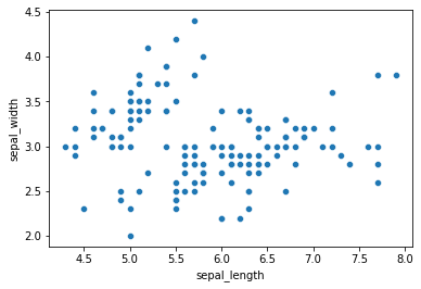
Scatter Plot
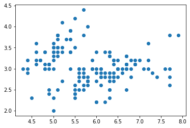
Podemos crear directo el scatter o podemos crear una figura caracterizandola y personalizando los ejes con plt.subplots():
# creamos la figura y los ejes
plt.scatter(iris['sepal_length'], iris['sepal_width'])
<matplotlib.collections.PathCollection at 0x1e81ab8e088>
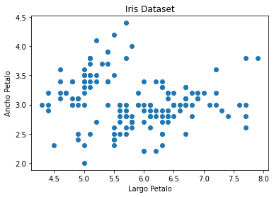
Ahora vamos a añadir unos detalles al plot para hacerlo mas comprensible:
fig, ax = plt.subplots()
ax.scatter(iris['sepal_length'], iris['sepal_width'])
ax.set_title('Iris Dataset')
ax.set_xlabel('Largo Petalo')
ax.set_ylabel('Ancho Petalo')
Text(0, 0.5, 'Ancho Petalo')
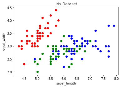
Podemos también plotear segun los colores de cada familia:
colors = {'setosa':'r', 'versicolor':'g', 'virginica':'b'}
fig, ax = plt.subplots()
for i in range(len(iris['sepal_length'])):
ax.scatter(iris['sepal_length'][i], iris['sepal_width'][i],color=colors[iris['class'][i]])
ax.set_title('Iris Dataset')
ax.set_xlabel('sepal_length')
ax.set_ylabel('sepal_width')
Text(0, 0.5, 'sepal_width')
Plot
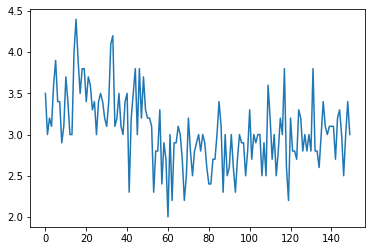
Con la función plot podemos graficar nuestras graficas de lineas
x_data = range(0, iris.shape[0])
plt.plot(x_data, iris['sepal_width'])
[<matplotlib.lines.Line2D at 0x1e81d7d08c8>]
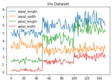
Podemos graficar más de uno a la vez:
# get columns to plot
columns = iris.columns.drop(['class'])
# create x data
x_data = range(0, iris.shape[0])
# create figure and axis
fig, ax = plt.subplots()
# plot each column
for column in columns:
ax.plot(x_data, iris[column], label=column)
# set title and legend
ax.set_title('Iris Dataset')
ax.legend()
<matplotlib.legend.Legend at 0x1e81d728b88>
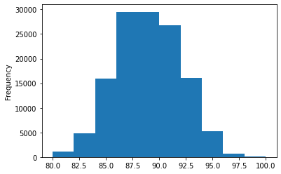
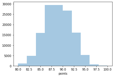
Histogramas
Con la función hist podemos crear histogramas. Cuando le pasamos una variable categorica en automatico nos calculará su frecuencia en el DB.
fig, ax = plt.subplots()
ax.hist(wine_reviews['points'])
ax.set_title('Puntaje de los vinos')
ax.set_xlabel('Puntaje')
ax.set_ylabel('Frecuencia')
Text(0, 0.5, 'Frecuencia')
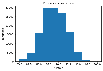
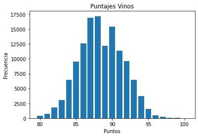
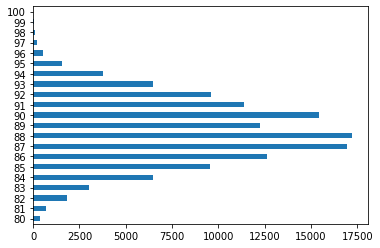
Grafico de barras
Utilizando la función bar podemos crear una grafica de barra. En este caso no se calculará en automatico la frecuencia y por lo tanto tendremos que hacerlo manualmente nosotros. Este grafico funciona bien cuando no tenemos demasiadas variables categoricas (<30)
fig, ax = plt.subplots()
# calculamos la frecuencia para cada categoria de datos
data = wine_reviews['points'].value_counts()
# definimos la x y la y
points = data.index
frequency = data.values
# creamos el grafico
ax.bar(points, frequency)
ax.set_title('Puntajes Vinos')
ax.set_xlabel('Puntos')
ax.set_ylabel('Frecuencia')
Text(0, 0.5, 'Frecuencia')
Pandas
Ya conocemos las propriedades de panda en manejar dataframes, pero es también una buena herramienta para construir graficas. Construida sobre Matplotlib es de más alto nivel y por lo tanto necesitaremos menos codigos para construir nuestras graficas.
Por ejemplo:
Scatter plot
iris.plot.scatter(x='sepal_length', y='sepal_width', title='Iris Dataset')
<AxesSubplot:title={'center':'Iris Dataset'}, xlabel='sepal_length', ylabel='sepal_width'>
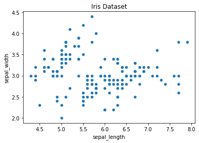
Grafico de Lineas
En ese caso no tendremos que hacer un loop para cada columna siendo que en automatico ploteará todas las columnas.
iris.drop(['class'], axis=1).plot.line(title='Iris Dataset')
<AxesSubplot:title={'center':'Iris Dataset'}>

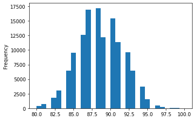
Histogramas
No tenemos que pasarle ningun argumento aunque podamos especificar el ancho de los intervalos eventualmente
wine_reviews['points'].plot.hist()
<AxesSubplot:ylabel='Frequency'>
wine_reviews['points'].plot.hist(bins=30)
<AxesSubplot:ylabel='Frequency'>
Finalmente podemos crear multiples histogramas, con subplots especificamos que queremos un histograma para cada columna mientras en el layout especificamos como acomodarlos.
iris.plot.hist(subplots=True, layout=(2,2), figsize=(10, 10), bins=20)
array([[<AxesSubplot:ylabel='Frequency'>,
<AxesSubplot:ylabel='Frequency'>],
[<AxesSubplot:ylabel='Frequency'>,
<AxesSubplot:ylabel='Frequency'>]], dtype=object)
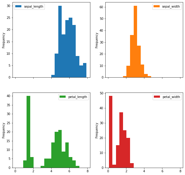
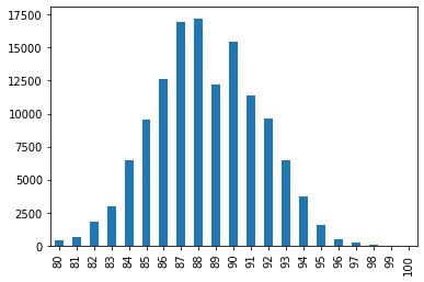
Grafico de Barras
Cuando utilizamos el grafico de barras de nuevotendremos que contar los valores y luego ordenarlos del menor al mayor para poder obtener la grafica correcta.
wine_reviews['points'].value_counts().sort_index().plot.bar()
<AxesSubplot:>
Como vimos en la pasada clase podemos hacerlo también horizontal nuestro grafico:
wine_reviews['points'].value_counts().sort_index().plot.barh()
<AxesSubplot:>
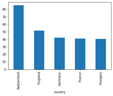
Podemos tmabién plotear cosas que no son las frecuencias, agrupamos los datos por país y luego tomamos la media de esos:
wine_reviews.groupby("country").price.mean().sort_values(ascending=False)[:5].plot.bar()
<AxesSubplot:xlabel='country'>
Seaborn
Con seaborn podemos obtner lo mismo resultado vistos previamente, con un estilo diferente.
Scatter Plot
En este caso tendremos que especificar el DB desde que tomar los datos en cuanto no lo estamos llamando directamente:
sns.scatterplot(x='sepal_length', y='sepal_width', data=iris)
<AxesSubplot:xlabel='sepal_length', ylabel='sepal_width'>
Podemos también defini colores con respecto a algun grupo especifico:
sns.scatterplot(x='sepal_length', y='sepal_width', hue='class', data=iris)
<AxesSubplot:xlabel='sepal_length', ylabel='sepal_width'>
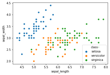
Grafico de Lineas
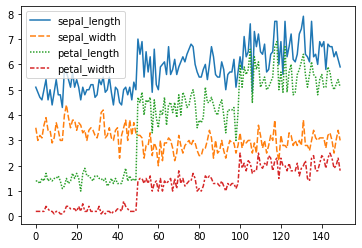
Podemos utilizar el clasico lineplot, al cual tendremos solo que pasar el dataframe o el kdeplo en presencia de muchos outliers, así de obtener un grafico más suave.
sns.lineplot(data=iris.drop(['class'], axis=1))
<AxesSubplot:>
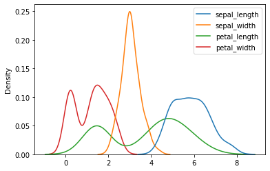
Podemos plotear también la densidad:
sns.kdeplot(data=iris.drop(['class'], axis=1))
<AxesSubplot:ylabel='Density'>
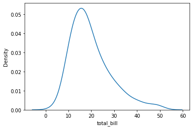
Densidades
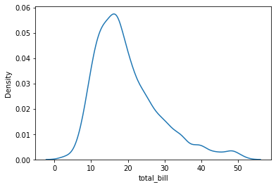
tips = sns.load_dataset("tips")
sns.kdeplot(data=tips, x="total_bill")
<AxesSubplot:xlabel='total_bill', ylabel='Density'>
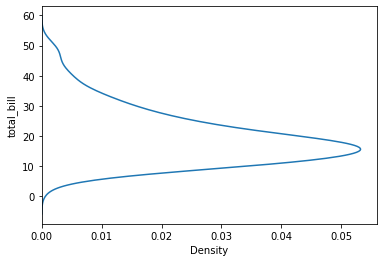
Podemos también cambiar el eje, imponiendo la y:
sns.kdeplot(data=tips, y="total_bill")
<AxesSubplot:xlabel='Density', ylabel='total_bill'>
Podemos ajustar el bandwith para obtener graficos mas o menos smooth:
sns.kdeplot(data=tips, x="total_bill", bw_adjust=.6)
<AxesSubplot:xlabel='total_bill', ylabel='Density'>
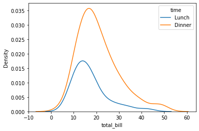
sns.kdeplot(data=tips, x="total_bill", hue="time")
<AxesSubplot:xlabel='total_bill', ylabel='Density'>
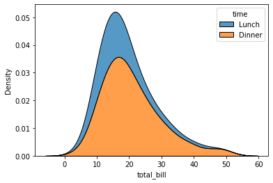
Podemos plotear las distintas categorias como vimos antes y stackearlas, osea sumarlas verticalmente:
sns.kdeplot(data=tips, x="total_bill", hue="time", multiple="stack")
<AxesSubplot:xlabel='total_bill', ylabel='Density'>
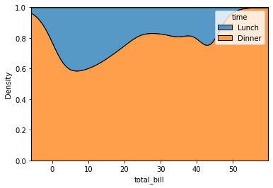
Finalmente podemos normalizar a 100 la distribuciones stacked
sns.kdeplot(data=tips, x="total_bill", hue="time", multiple="fill")
<AxesSubplot:xlabel='total_bill', ylabel='Density'>
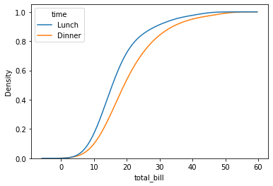
Finalmente podemos crear una grafica cumulada, normalizando por cada grupo:
sns.kdeplot(
data=tips, x="total_bill", hue="time",
cumulative=True, common_norm=False, common_grid=True,
)
<AxesSubplot:xlabel='total_bill', ylabel='Density'>
Histogramas
en este caso tendremos que especificar que columna queremos plotear y por esa se calcularán las frecuencia. tenemos ademas especificar el numero de intervalos y, en el caso, si queremos plotear también la densidad del kernel gaussiano.
sns.distplot(wine_reviews['points'], bins=10, kde=False)
C:\ProgramData\Anaconda3\lib\site-packages\seaborn\distributions.py:2557: FutureWarning: `distplot` is a deprecated function and will be removed in a future version. Please adapt your code to use either `displot` (a figure-level function with similar flexibility) or `histplot` (an axes-level function for histograms).
warnings.warn(msg, FutureWarning)
<AxesSubplot:xlabel='points'>
sns.distplot(wine_reviews['points'], bins=10, kde=True)
<AxesSubplot:xlabel='points', ylabel='Density'>
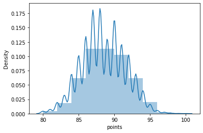
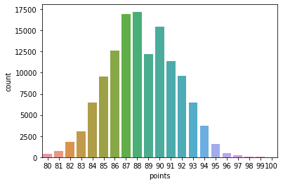
Grafico de barra
en este caso es suficiente pasar los datos que queremos graficar sin necesidad de hacer un conteo:
sns.countplot(wine_reviews['points'])
C:\ProgramData\Anaconda3\lib\site-packages\seaborn\_decorators.py:43: FutureWarning: Pass the following variable as a keyword arg: x. From version 0.12, the only valid positional argument will be `data`, and passing other arguments without an explicit keyword will result in an error or misinterpretation.
FutureWarning
<AxesSubplot:xlabel='points', ylabel='count'>
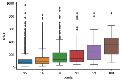
Boxplot
nos permite representar lo que en ingles definen como Five-number summay:
minimo
primer cuartil
mediana
tercer cuartil
maximo
df = wine_reviews[(wine_reviews['points']>=95) & (wine_reviews['price']<1000)]
sns.boxplot('points', 'price', data=df)
C:\ProgramData\Anaconda3\lib\site-packages\seaborn\_decorators.py:43: FutureWarning: Pass the following variables as keyword args: x, y. From version 0.12, the only valid positional argument will be `data`, and passing other arguments without an explicit keyword will result in an error or misinterpretation.
FutureWarning
<AxesSubplot:xlabel='points', ylabel='price'>
Mapas de calor
Un mapa de calor es una representación gráfica de datos donde los valores individuales contenidos en una matriz se representan como colores. Los mapas de calor son perfectos para explorar la correlación de características en un conjunto de datos.
La podemos hacer tanto con Matplotlib como con seaborn… pero hay diferencias:
# calculamos las correlaciones
corr = iris.corr()
fig, ax = plt.subplots()
im = ax.imshow(corr.values)
ax.set_xticks(np.arange(len(corr.columns)))
ax.set_yticks(np.arange(len(corr.columns)))
ax.set_xticklabels(corr.columns)
ax.set_yticklabels(corr.columns)
#rotamos las etiquetas
plt.setp(ax.get_xticklabels(), rotation=45, ha="right",
rotation_mode="anchor")
#hacemos un loop con respecto a las distintas dimensiones de los datos y creamos las notas de texco
for i in range(len(corr.columns)):
for j in range(len(corr.columns)):
text = ax.text(j, i, np.around(corr.iloc[i, j], decimals=2),
ha="center", va="center", color="black")
sns.heatmap(iris.corr(), annot=True)
<AxesSubplot:>
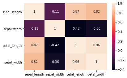
más facil….
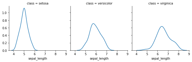
Faceting
Es el acto de dividir los datos con respecto a distintos subplot y combinarlos en un unica figura. Es muy util tambien cuando queremos hacer una analisis exploratoria de los datos. En seaborn vamos a utilziar la función FacetGrid. Antes definimos la función con respecto al cual queremos descomponer el analisis y luego definimos la funcion map para definir el tipo de plot así como la caolumna (variable) que queremos definir. Documentación
g = sns.FacetGrid(iris, col='class')
g = g.map(sns.kdeplot, 'sepal_length')
db.groupby('response')['salary'].median()
response
no 60000
yes 60000
Name: salary, dtype: int64
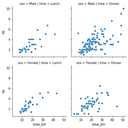
g = sns.FacetGrid(tips, col="time", row="sex")
g.map(sns.scatterplot, "total_bill", "tip")
<seaborn.axisgrid.FacetGrid at 0x1e829f3d348>
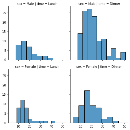
g = sns.FacetGrid(tips, col="time", row="sex")
g.map_dataframe(sns.histplot, x="total_bill")
<seaborn.axisgrid.FacetGrid at 0x1e82a09d488>
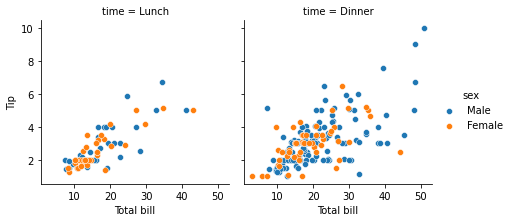
g = sns.FacetGrid(tips, col="time", hue="sex")
g.map_dataframe(sns.scatterplot, x="total_bill", y="tip")
g.set_axis_labels("Total bill", "Tip")
g.add_legend()
<seaborn.axisgrid.FacetGrid at 0x1e82a0bdd08>
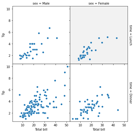
g = sns.FacetGrid(tips, col="sex", row="time", margin_titles=True, despine=False)
g.map_dataframe(sns.scatterplot, x="total_bill", y="tip")
g.set_axis_labels("Total bill", "Tip")
g.fig.subplots_adjust(wspace=0, hspace=0)
for (row_val, col_val), ax in g.axes_dict.items():
if row_val == "Lunch" and col_val == "Female":
ax.set_facecolor(".95")
else:
ax.set_facecolor((0, 0, 0, 0))
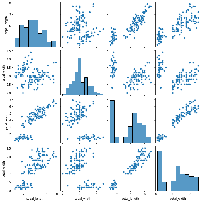
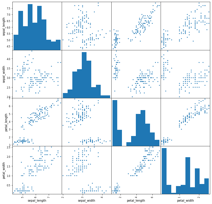
Pairplot
Por último, vemos el diagrama de pares de Seaborns y Pandas scatter_matrix, que permiten trazar una cuadrícula de relaciones por pares en un conjunto de datos. Estas técnicas siempre plotean dos características entre sí. La diagonal del gráfico está llena de histogramas y los otros gráficos son gráficos de dispersión.
sns.pairplot(iris)
<seaborn.axisgrid.PairGrid at 0x1e82a49f948>
from pandas.plotting import scatter_matrix
fig, ax = plt.subplots(figsize=(12,12))
scatter_matrix(iris, alpha=1, ax=ax)
C:\ProgramData\Anaconda3\lib\site-packages\ipykernel_launcher.py:4: UserWarning: To output multiple subplots, the figure containing the passed axes is being cleared
after removing the cwd from sys.path.
array([[<AxesSubplot:xlabel='sepal_length', ylabel='sepal_length'>,
<AxesSubplot:xlabel='sepal_width', ylabel='sepal_length'>,
<AxesSubplot:xlabel='petal_length', ylabel='sepal_length'>,
<AxesSubplot:xlabel='petal_width', ylabel='sepal_length'>],
[<AxesSubplot:xlabel='sepal_length', ylabel='sepal_width'>,
<AxesSubplot:xlabel='sepal_width', ylabel='sepal_width'>,
<AxesSubplot:xlabel='petal_length', ylabel='sepal_width'>,
<AxesSubplot:xlabel='petal_width', ylabel='sepal_width'>],
[<AxesSubplot:xlabel='sepal_length', ylabel='petal_length'>,
<AxesSubplot:xlabel='sepal_width', ylabel='petal_length'>,
<AxesSubplot:xlabel='petal_length', ylabel='petal_length'>,
<AxesSubplot:xlabel='petal_width', ylabel='petal_length'>],
[<AxesSubplot:xlabel='sepal_length', ylabel='petal_width'>,
<AxesSubplot:xlabel='sepal_width', ylabel='petal_width'>,
<AxesSubplot:xlabel='petal_length', ylabel='petal_width'>,
<AxesSubplot:xlabel='petal_width', ylabel='petal_width'>]],
dtype=object)
Plotly
El paquete plotly Python existe para crear, manipular y renderizar figuras gráficas (es decir, tablas, diagramas, mapas y diagramas) representadas por estructuras de datos también denominadas figuras. El proceso de renderizado usa la biblioteca de JavaScript Plotly.js como bajo capa, aunque los desarrolladores de Python que usan este módulo rara vez necesitan interactuar con la biblioteca de Javascript directamente, si es que alguna vez lo hacen. Las figuras se pueden representar en Python como dictados o como instancias de la clase plotly.graph_objects.Figure, y se serializan como texto en JavaScript Object Notation (JSON) antes de pasar a Plotly.js.
import plotly.express as px
fig = px.line(x=["a","b","c"], y=[1,3,2], title="sample figure")
print(fig)
fig.show()
Figure({
'data': [{'hovertemplate': 'x=%{x}<br>y=%{y}<extra></extra>',
'legendgroup': '',
'line': {'color': '#636efa', 'dash': 'solid'},
'mode': 'lines',
'name': '',
'orientation': 'v',
'showlegend': False,
'type': 'scatter',
'x': array(['a', 'b', 'c'], dtype=object),
'xaxis': 'x',
'y': array([1, 3, 2], dtype=int64),
'yaxis': 'y'}],
'layout': {'legend': {'tracegroupgap': 0},
'template': '...',
'title': {'text': 'sample figure'},
'xaxis': {'anchor': 'y', 'domain': [0.0, 1.0], 'title': {'text': 'x'}},
'yaxis': {'anchor': 'x', 'domain': [0.0, 1.0], 'title': {'text': 'y'}}}
})
Las figuras se organizan en diferentes niveles. En particular tendremos 3 niveles Top:
data
layout
frames
Finalmente podemos configurar más profundamente nuestras graficas aunque el plotly.express nos ofrece numerosas opciones predeterminadas.
df = px.data.stocks()
fig = px.line(df, x='date', y="GOOG")
fig.show()
df = px.data.stocks(indexed=True)-1
fig = px.bar(df, x=df.index, y="GOOG")
fig.show()
fig = px.area(df, facet_col="company", facet_col_wrap=2)
fig.show()
import plotly.express as px
df = px.data.stocks()
fig = px.line(df, x="date", y=df.columns,
hover_data={"date": "|%B %d, %Y"},
title='custom tick labels')
fig.update_xaxes(
dtick="M1",
tickformat="%b\n%Y")
fig.show()
import plotly.graph_objects as go
df = pd.read_csv('https://raw.githubusercontent.com/plotly/datasets/master/finance-charts-apple.csv')
fig = px.histogram(df, x="Date", y="AAPL.Close", histfunc="avg", title="Histogram on Date Axes")
fig.update_traces(xbins_size="M1")
fig.update_xaxes(showgrid=True, ticklabelmode="period", dtick="M1", tickformat="%b\n%Y")
fig.update_layout(bargap=0.1)
fig.add_trace(go.Scatter(mode="markers", x=df["Date"], y=df["AAPL.Close"], name="daily"))
fig.show()
fig = px.line(df, x='Date', y='AAPL.High', title='Time Series with Rangeslider')
fig.update_xaxes(rangeslider_visible=True)
fig.show()
df = px.data.iris()
fig = px.scatter(df, x="sepal_width", y="sepal_length", color="species",
size='petal_length', hover_data=['petal_width'])
fig.show()
fig = go.Figure(data=go.Scatter(
y = np.random.randn(500),
mode='markers',
marker=dict(
size=16,
color=np.random.randn(500), #set color equal to a variable
colorscale='Viridis', # one of plotly colorscales
showscale=True
)
))
fig.show()
import math
# Load data, define hover text and bubble size
data = px.data.gapminder()
df_2007 = data[data['year']==2007]
df_2007 = df_2007.sort_values(['continent', 'country'])
hover_text = []
bubble_size = []
for index, row in df_2007.iterrows():
hover_text.append(('Country: {country}<br>'+
'Life Expectancy: {lifeExp}<br>'+
'GDP per capita: {gdp}<br>'+
'Population: {pop}<br>'+
'Year: {year}').format(country=row['country'],
lifeExp=row['lifeExp'],
gdp=row['gdpPercap'],
pop=row['pop'],
year=row['year']))
bubble_size.append(math.sqrt(row['pop']))
df_2007['text'] = hover_text
df_2007['size'] = bubble_size
sizeref = 2.*max(df_2007['size'])/(100**2)
# Dictionary with dataframes for each continent
continent_names = ['Africa', 'Americas', 'Asia', 'Europe', 'Oceania']
continent_data = {continent:df_2007.query("continent == '%s'" %continent)
for continent in continent_names}
# Create figure
fig = go.Figure()
for continent_name, continent in continent_data.items():
fig.add_trace(go.Scatter(
x=continent['gdpPercap'], y=continent['lifeExp'],
name=continent_name, text=continent['text'],
marker_size=continent['size'],
))
# Tune marker appearance and layout
fig.update_traces(mode='markers', marker=dict(sizemode='area',
sizeref=sizeref, line_width=2))
fig.update_layout(
title='Life Expectancy v. Per Capita GDP, 2007',
xaxis=dict(
title='GDP per capita (2000 dollars)',
gridcolor='white',
type='log',
gridwidth=2,
),
yaxis=dict(
title='Life Expectancy (years)',
gridcolor='white',
gridwidth=2,
),
paper_bgcolor='rgb(243, 243, 243)',
plot_bgcolor='rgb(243, 243, 243)',
)
fig.show()
fig = go.Figure(data=go.Scatter(
x=[1, 2, 3, 4],
y=[2, 1, 3, 4],
error_y=dict(
type='data',
symmetric=False,
array=[0.1, 0.2, 0.1, 0.1],
arrayminus=[0.2, 0.4, 1, 0.2])
))
fig.show()
schools = ["Brown", "NYU", "Notre Dame", "Cornell", "Tufts", "Yale",
"Dartmouth", "Chicago", "Columbia", "Duke", "Georgetown",
"Princeton", "U.Penn", "Stanford", "MIT", "Harvard"]
fig = go.Figure()
fig.add_trace(go.Scatter(
x=[72, 67, 73, 80, 76, 79, 84, 78, 86, 93, 94, 90, 92, 96, 94, 112],
y=schools,
marker=dict(color="crimson", size=12),
mode="markers",
name="Women",
))
fig.add_trace(go.Scatter(
x=[92, 94, 100, 107, 112, 114, 114, 118, 119, 124, 131, 137, 141, 151, 152, 165],
y=schools,
marker=dict(color="gold", size=12),
mode="markers",
name="Men",
))
fig.update_layout(title="Gender Earnings Disparity",
xaxis_title="Annual Salary (in thousands)",
yaxis_title="School")
fig.show()
stages = ["Website visit", "Downloads", "Potential customers", "Requested price", "invoice sent"]
df_mtl = pd.DataFrame(dict(number=[39, 27.4, 20.6, 11, 3], stage=stages))
df_mtl['office'] = 'Montreal'
df_toronto = pd.DataFrame(dict(number=[52, 36, 18, 14, 5], stage=stages))
df_toronto['office'] = 'Toronto'
df = pd.concat([df_mtl, df_toronto], axis=0)
fig = px.funnel(df, x='number', y='stage', color='office')
fig.show()
df = px.data.medals_wide(indexed=True)
fig = px.imshow(df)
fig.show()
df = px.data.iris()
fig = px.scatter_3d(df, x='sepal_length', y='sepal_width', z='petal_width',
color='petal_length', symbol='species')
fig.show()
df = px.data.iris()
fig = px.scatter_3d(df, x='sepal_length', y='sepal_width', z='petal_width',
color='petal_length', size='petal_length', size_max=18,
symbol='species', opacity=0.7)
# tight layout
fig.update_layout(margin=dict(l=0, r=0, b=0, t=0))
z_data = pd.read_csv('https://raw.githubusercontent.com/plotly/datasets/master/api_docs/mt_bruno_elevation.csv')
fig = go.Figure(data=[go.Surface(z=z_data.values)])
fig.update_traces(contours_z=dict(show=True, usecolormap=True,
highlightcolor="limegreen", project_z=True))
fig.update_layout(title='Mt Bruno Elevation', autosize=False,
scene_camera_eye=dict(x=1.87, y=0.88, z=-0.64),
width=500, height=500,
margin=dict(l=65, r=50, b=65, t=90)
)
fig.show()
df = pd.read_csv('https://raw.githubusercontent.com/plotly/datasets/master/2011_february_us_airport_traffic.csv')
df['text'] = df['airport'] + '' + df['city'] + ', ' + df['state'] + '' + 'Arrivals: ' + df['cnt'].astype(str)
fig = go.Figure(data=go.Scattergeo(
lon = df['long'],
lat = df['lat'],
text = df['text'],
mode = 'markers',
marker_color = df['cnt'],
))
fig.update_layout(
title = 'Most trafficked US airports<br>(Hover for airport names)',
geo_scope='usa',
)
fig.show()
from urllib.request import urlopen
import json
with urlopen('https://raw.githubusercontent.com/plotly/datasets/master/geojson-counties-fips.json') as response:
counties = json.load(response)
df = pd.read_csv("https://raw.githubusercontent.com/plotly/datasets/master/fips-unemp-16.csv",
dtype={"fips": str})
fig = px.choropleth_mapbox(df, geojson=counties, locations='fips', color='unemp',
color_continuous_scale="Viridis",
range_color=(0, 12),
mapbox_style="carto-positron",
zoom=3, center = {"lat": 37.0902, "lon": -95.7129},
opacity=0.5,
labels={'unemp':'unemployment rate'}
)
fig.update_layout(margin={"r":0,"t":0,"l":0,"b":0})
fig.show()
df = px.data.iris()
fig = px.parallel_coordinates(df, color="species_id", labels={"species_id": "Species",
"sepal_width": "Sepal Width", "sepal_length": "Sepal Length",
"petal_width": "Petal Width", "petal_length": "Petal Length", },
color_continuous_scale=px.colors.diverging.Tealrose,
color_continuous_midpoint=2)
fig.show()
df = px.data.gapminder().query("year == 2007")
df["world"] = "world" # in order to have a single root node
fig = px.treemap(df, path=['world', 'continent', 'country'], values='pop',
color='lifeExp', hover_data=['iso_alpha'],
color_continuous_scale='RdBu',
color_continuous_midpoint=np.average(df['lifeExp'], weights=df['pop']))
fig.show()
df = px.data.gapminder().query("year == 2007").query("continent == 'Europe'")
df.loc[df['pop'] < 2.e6, 'country'] = 'Other countries' # Represent only large countries
fig = px.pie(df, values='pop', names='country', title='Population of European continent')
fig.show()
Muchas veces necesitamos una llave para poder acceder a los datos que requerimos. Igual hay un verdadero mercado y sitio especializados para esto.
Por medio de los encabezaados HTTPS se manejan algunas informaciones sobre las APIs
response = requests.get("https://api.thedogapi.com/v1/breeds/1")
response.headers
{'Content-Encoding': 'gzip', 'Content-Type': 'application/json; charset=utf-8', 'Date': 'Fri, 07 May 2021 12:19:43 GMT', 'Server': 'Apache/2.4.46 (Amazon)', 'Strict-Transport-Security': 'max-age=15552000; includeSubDomains', 'Vary': 'Origin,Accept-Encoding', 'X-Content-Type-Options': 'nosniff', 'X-DNS-Prefetch-Control': 'off', 'X-Download-Options': 'noopen', 'X-Frame-Options': 'SAMEORIGIN', 'X-Response-Time': '2ms', 'X-XSS-Protection': '1; mode=block', 'Content-Length': '265', 'Connection': 'keep-alive'}
Ya sabiendo que es un json, podemos acceder a el atravez de:
response.json()["name"]
'Affenpinscher'
endpoint = "https://www.googleapis.com/books/v1/volumes"
query = "la divina comedia"
params = {"q": query, "maxResults": 3}
response = requests.get(endpoint, params=params).json()
for book in response["items"]:
volume = book["volumeInfo"]
title = volume["title"]
published = volume["authors"]
print(f"{title} {published} ")
La Divina Comedia ['Dante Alighieri']
La divina comedia ['Dante Alghieri']
La Divina Comedia por Dante Alighieri ['Dante Alighieri']
response
{'kind': 'books#volumes',
'totalItems': 734,
'items': [{'kind': 'books#volume',
'id': 'WrPCDwAAQBAJ',
'etag': 'j6ynahmNPaE',
'selfLink': 'https://www.googleapis.com/books/v1/volumes/WrPCDwAAQBAJ',
'volumeInfo': {'title': 'La Divina Comedia',
'authors': ['Dante Alighieri'],
'publisher': 'Good Press',
'publishedDate': '2019-11-11',
'description': '"La Divina Comedia" de Dante Alighieri (traducido por Manuel Aranda y Sanjuan) de la Editorial Good Press. Good Press publica una gran variedad de títulos que abarca todos los géneros. Van desde los títulos clásicos famosos, novelas, textos documentales y crónicas de la vida real, hasta temas ignorados o por ser descubiertos de la literatura universal. Editorial Good Press divulga libros que son una lectura imprescindible. Cada publicación de Good Press ha sido corregida y formateada al detalle, para elevar en gran medida su facilidad de lectura en todos los equipos y programas de lectura electrónica. Nuestra meta es la producción de Libros electrónicos que sean versátiles y accesibles para el lector y para todos, en un formato digital de alta calidad.',
'industryIdentifiers': [{'type': 'OTHER',
'identifier': 'EAN:4057664122674'}],
'readingModes': {'text': True, 'image': True},
'pageCount': 941,
'printType': 'BOOK',
'categories': ['Fiction'],
'maturityRating': 'NOT_MATURE',
'allowAnonLogging': True,
'contentVersion': '1.5.5.0.preview.3',
'panelizationSummary': {'containsEpubBubbles': False,
'containsImageBubbles': False},
'imageLinks': {'smallThumbnail': 'http://books.google.com/books/content?id=WrPCDwAAQBAJ&printsec=frontcover&img=1&zoom=5&edge=curl&source=gbs_api',
'thumbnail': 'http://books.google.com/books/content?id=WrPCDwAAQBAJ&printsec=frontcover&img=1&zoom=1&edge=curl&source=gbs_api'},
'language': 'es',
'previewLink': 'http://books.google.com.mx/books?id=WrPCDwAAQBAJ&pg=PP1&dq=la+divina+comedia&hl=&cd=1&source=gbs_api',
'infoLink': 'https://play.google.com/store/books/details?id=WrPCDwAAQBAJ&source=gbs_api',
'canonicalVolumeLink': 'https://play.google.com/store/books/details?id=WrPCDwAAQBAJ'},
'saleInfo': {'country': 'MX',
'saleability': 'FOR_SALE',
'isEbook': True,
'listPrice': {'amount': 25, 'currencyCode': 'MXN'},
'retailPrice': {'amount': 25, 'currencyCode': 'MXN'},
'buyLink': 'https://play.google.com/store/books/details?id=WrPCDwAAQBAJ&rdid=book-WrPCDwAAQBAJ&rdot=1&source=gbs_api',
'offers': [{'finskyOfferType': 1,
'listPrice': {'amountInMicros': 25000000, 'currencyCode': 'MXN'},
'retailPrice': {'amountInMicros': 25000000, 'currencyCode': 'MXN'},
'giftable': True}]},
'accessInfo': {'country': 'MX',
'viewability': 'PARTIAL',
'embeddable': True,
'publicDomain': False,
'textToSpeechPermission': 'ALLOWED',
'epub': {'isAvailable': True},
'pdf': {'isAvailable': True},
'webReaderLink': 'http://play.google.com/books/reader?id=WrPCDwAAQBAJ&hl=&printsec=frontcover&source=gbs_api',
'accessViewStatus': 'SAMPLE',
'quoteSharingAllowed': False},
'searchInfo': {'textSnippet': '"La Divina Comedia" de Dante Alighieri (traducido por Manuel Aranda y Sanjuan) de la Editorial Good Press.'}},
{'kind': 'books#volume',
'id': 'wGPSDgAAQBAJ',
'etag': 'NOQVX9XaqiA',
'selfLink': 'https://www.googleapis.com/books/v1/volumes/wGPSDgAAQBAJ',
'volumeInfo': {'title': 'La divina comedia',
'subtitle': '',
'authors': ['Dante Alghieri'],
'publisher': 'NoBooks Editorial',
'publishedDate': '1976',
'readingModes': {'text': True, 'image': True},
'pageCount': 441,
'printType': 'BOOK',
'maturityRating': 'NOT_MATURE',
'allowAnonLogging': True,
'contentVersion': 'preview-1.0.0',
'panelizationSummary': {'containsEpubBubbles': False,
'containsImageBubbles': False},
'imageLinks': {'smallThumbnail': 'http://books.google.com/books/content?id=wGPSDgAAQBAJ&printsec=frontcover&img=1&zoom=5&edge=curl&source=gbs_api',
'thumbnail': 'http://books.google.com/books/content?id=wGPSDgAAQBAJ&printsec=frontcover&img=1&zoom=1&edge=curl&source=gbs_api'},
'language': 'es',
'previewLink': 'http://books.google.com.mx/books?id=wGPSDgAAQBAJ&printsec=frontcover&dq=la+divina+comedia&hl=&cd=2&source=gbs_api',
'infoLink': 'https://play.google.com/store/books/details?id=wGPSDgAAQBAJ&source=gbs_api',
'canonicalVolumeLink': 'https://play.google.com/store/books/details?id=wGPSDgAAQBAJ'},
'saleInfo': {'country': 'MX',
'saleability': 'FOR_SALE',
'isEbook': True,
'listPrice': {'amount': 28.84, 'currencyCode': 'MXN'},
'retailPrice': {'amount': 28.84, 'currencyCode': 'MXN'},
'buyLink': 'https://play.google.com/store/books/details?id=wGPSDgAAQBAJ&rdid=book-wGPSDgAAQBAJ&rdot=1&source=gbs_api',
'offers': [{'finskyOfferType': 1,
'listPrice': {'amountInMicros': 28840000, 'currencyCode': 'MXN'},
'retailPrice': {'amountInMicros': 28840000, 'currencyCode': 'MXN'},
'giftable': True}]},
'accessInfo': {'country': 'MX',
'viewability': 'PARTIAL',
'embeddable': True,
'publicDomain': False,
'textToSpeechPermission': 'ALLOWED',
'epub': {'isAvailable': True},
'pdf': {'isAvailable': True},
'webReaderLink': 'http://play.google.com/books/reader?id=wGPSDgAAQBAJ&hl=&printsec=frontcover&source=gbs_api',
'accessViewStatus': 'SAMPLE',
'quoteSharingAllowed': False}},
{'kind': 'books#volume',
'id': 'O0ESIQu9_7wC',
'etag': 'bzi0xAGR2sk',
'selfLink': 'https://www.googleapis.com/books/v1/volumes/O0ESIQu9_7wC',
'volumeInfo': {'title': 'La Divina Comedia por Dante Alighieri',
'subtitle': 'El Infierno',
'authors': ['Dante Alighieri'],
'publishedDate': '1870',
'industryIdentifiers': [{'type': 'OTHER',
'identifier': 'IBNF:CF005685501'}],
'readingModes': {'text': False, 'image': False},
'pageCount': 232,
'printType': 'BOOK',
'maturityRating': 'NOT_MATURE',
'allowAnonLogging': False,
'contentVersion': '0.2.1.0.preview.0',
'panelizationSummary': {'containsEpubBubbles': False,
'containsImageBubbles': False},
'imageLinks': {'smallThumbnail': 'http://books.google.com/books/content?id=O0ESIQu9_7wC&printsec=frontcover&img=1&zoom=5&source=gbs_api',
'thumbnail': 'http://books.google.com/books/content?id=O0ESIQu9_7wC&printsec=frontcover&img=1&zoom=1&source=gbs_api'},
'language': 'es',
'previewLink': 'http://books.google.com.mx/books?id=O0ESIQu9_7wC&q=la+divina+comedia&dq=la+divina+comedia&hl=&cd=3&source=gbs_api',
'infoLink': 'http://books.google.com.mx/books?id=O0ESIQu9_7wC&dq=la+divina+comedia&hl=&source=gbs_api',
'canonicalVolumeLink': 'https://books.google.com/books/about/La_Divina_Comedia_por_Dante_Alighieri.html?hl=&id=O0ESIQu9_7wC'},
'saleInfo': {'country': 'MX',
'saleability': 'NOT_FOR_SALE',
'isEbook': False},
'accessInfo': {'country': 'MX',
'viewability': 'NO_PAGES',
'embeddable': False,
'publicDomain': False,
'textToSpeechPermission': 'ALLOWED',
'epub': {'isAvailable': False},
'pdf': {'isAvailable': False},
'webReaderLink': 'http://play.google.com/books/reader?id=O0ESIQu9_7wC&hl=&printsec=frontcover&source=gbs_api',
'accessViewStatus': 'NONE',
'quoteSharingAllowed': False}}]}
Fuentes: